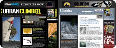
I was perusing my messages on The Facebook yesterday when I saw a notification from my “friend” Urban Climber Magazine that their website had been redesigned. I’m into websites and redesigns so I eagerly clicked through…and quickly did a double take. After a quick check of Climbing Magazine’s website I confirmed that my first impression was correct: Urban Climbers redesign was simply Climbing’s site with a different stylesheet!
While not surprising considering both magazines are owned by the same company, I would have thought having two websites that were basically identical would be a bit lame.
buy dapoxetine online https://www.phamatech.com/wp-content/themes/twentysixteen/inc/new/dapoxetine.html no prescription
Overall I have never been that psyched on the design of Climbing’s site so maybe that has jaded my opinion. Climbing.com has a lot of killer content, but I always found the site a bit hard to navigate. I mean, why should I have to re-load a whole new bloated page for each picture I want to browse in their galleries. This is 2008, there are many ways to do it up better. Add in the ubiquitous subscription boxes that never seem to display properly at the bottom of all the posts and it is enough to drive you crazy.
Sour grapes you might ask? Bummed that the ole Climbing Narc can’t get any run with any of the major publications?
buy singulair online https://www.phamatech.com/wp-content/themes/twentysixteen/inc/new/singulair.html no prescription
Maybe…but I don’t think I am alone in thinking ALL the major climbing magazines need to step their online games up. Agree or disagree?
[poll=75]


Agreeeeeeeeeeeeeeeeeeeeeeeeeeeeeeeeeeeeeeeeeed.
Having the same page reload over and over when browsing pictures on Climbing’s site is a bit lame given how is easy it would be not to. Alpinist has great content but half the functionality is broken. Rock and Ice could do so much better…
This said I like Escalademag.com but it’s in french…
loading...
word to the so brave and humble it hurts !!
loading...
They all kinda suck. Each has a ton of killer content but they all make it nearly impossible to find. Too bad the new urban climber didn’t do something completely different with their website since they usually try out random thing anyways. Now it is just cluttered and ugly.
loading...
As a software engineer in a previous life, I totally understand the philosophy behind “Why re-invent the wheel?” I use WordPress and Zenphoto and essentially my site is also the same as many others, with a different theme. That doesn’t make me feel bad.
However, if things aren’t working right, there always does come a moment of “It’s time to throw away the old wheel and start over completely.” And there’s certainly many a (not just magazine) website that has probably reached that point.
loading...
people go to climbing mag sites? weird.
loading...
That was sort of the funny thing for me. I spend most of my online time reading about climbing stuff and I hardly ever visit the mag sites.
loading...
The rags’ sites suck. Why go there when I came come to the Narc and have my Gravatar post up next to my name (edit: wait a minute, that didn’t work…)?
Midwest pride. JW
loading...