After quickly devouring my 2006 8a.nu Yearbook and promptly letting it sit under my car seat until Mrs. Narc made me throw it away last month, I was on the fence as to whether or not I wanted to order a 2007 yearbook. I enjoyed reading the 2006 version, but my actions after the fact left me with doubts about its long term value.
 Speaking of value, while it is advertised as being free, postage costs from Sweden combined with having to order a minimum of 10 books ended up costing me almost $20 last year. However, when I saw that this year only required a 2 book minimum I decided to throw down an order and was pleased that despite the increasingly poor performance of the U.S. dollar it only set us back $11.12. So, without further ado, here are my thoughts on the 2007 8a.
buy clomid online https://buynoprescriptionrxonline.net/dir/clomid.html no prescription
nu Yearbook.
All images are from the 8a.nu yearbook (click them to expand)
First Impressions
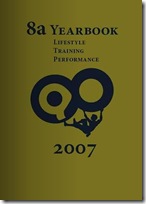
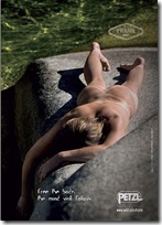
If first impressions are everything then the outside appearance of the yearbook leaves a lot to be desired. The front cover is dominated by a hideous vomit green color that makes you wonder if you are maybe reading a yearbook from 1977, not 2007. When you turn it over to check out the back cover you are confronted with one of the most bizarre climbing ads I have ever seen: a seemingly deceased naked women lying on  a rock with tan lines from her Petzl harness being the only thing she is “wearing”. I think we had better start looking at the inside of the yearbook before we change our minds.
The Layout/Content
Fortunately, the inside of the yearbook is much more eye pleasing than the outside. The pages are nicely designed with quality pictures (and ads) consistently complementing the content without overpowering it.
The content itself varies in quality depending on both your point of view and your interests. U.S. readers are probably not as interested in European World Cup results, and many people will be turned off by the amount of space devoted to ranking climbers. However, the articles and generous amount of pictures included within the rankings should offset some of these concerns.
Also of note, but perhaps not really the fault of the Swedish based publishers, is the high number of grammatical and spelling errors throughout the yearbook. Being that the yearbook is free* one can overlook some of these errors, but it is my hope to see this improve for next year’s book.
buy singulair online https://buynoprescriptionrxonline.net/dir/singulair.html no prescription
The Rankings
What would an 8a.nu project be without copious amounts of space devoted to rankings? Ranking climbers by: arbitrary criteria, route “scores”, boulder “scores”, age, gender…you name it, it is ranked in the 8a yearbook.
 The rankings are broken into 2 distinct categories (before being broken down into several subcategories): the 8a editorial decided “Climber of the Year 2007” and the rankings based on 8a.nu scorecard entries.
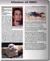
Initially I enjoyed reading the Climber of the Year section as it has interviews and insights on top climbers that I hadn’t seen before. Particularly interesting was the lengthy interview with Ethan Pringle (ranked 5th). However the list’s completely arbitrary attempt to rank something (climbers) that has no logical way of being ranked combined with the list’s 100 climber length had me just paging through looking at the pictures about half way through.
The second set of rankings is based on 8a.nu scorecard scores for 2007. It is broken down into  (follow me here) Routes, Boulders, Combined, Female Routes, Female Boulders, Female Combined, Junior Routes, Junior Boulders and Junior combined. With these lists I pretty much went straight to thumbing through the pictures as the ranking scores themselves really don’t mean that much to me. I mean, does anyone really know what it means that Paul Robinson had 53 more points last year than Daniel Woods and Dai Koyamada? Obviously it means he climbed more hard problems, but I don’t think I am alone in thinking that assigning scores to routes and problems doesn’t seem to have caught on.
The Pictures
This is where the yearbook really impressed me. With roughly 160 pictures (not including ads which were generally nice to look at) spread across its 80 pages, the yearbook gives you plenty to look at. Not only does it feature pictures from photographers we are used to seeing in U.S. publications like Simon Carter and Keith Ladzinski, it provides a great outlet for lesser known people to get their images published like Hayden Miller and John Vallejo (among others). Also, for readers in the U.S. it offers us a lot more exposure to photos from European photographers whose images we don’t normally get to see. If nothing else, the 8a yearbook serves as a nice photobook to flip through from time to time.
The Articles
 The articles featured throughout the yearbook are broken up into a section of 8a.nu “Statements” and articles on various climbers and locations. The 8a Statements are not really anything new, however this section does include a cool month by month recap of notable climbing news from 2007 which I would have liked to see even more of.
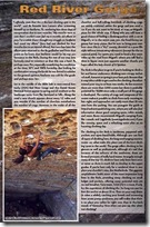
The remaining articles range from interviews with climbers like Lynn Hill and Daniel Woods, to tips on training to information on a few areas like the Red River Gorge, KY and Lleida, Spain. For the most part these articles are interesting reads, and they are accompanied by many nice pictures.
More than anywhere else in the yearbook, the articles have several typos and grammatical errors, but I wouldn’t say that they detract too badly from the overall content. I also noticed at least a couple of factual errors in the articles including a statement that the Motherlode is part of the PMRP at the Red River Gorge which I am pretty sure is not correct.
Final Thoughts
Overall I was quite pleased with the 2007 yearbook. Its variety of pictures and interviews with top climbers make it worthwhile even if you are turned off by the focus on numbers. If you want to get a sneak peak of the 2007 yearbook online, 8a has a web based version for you to flip through and you can order your own copy through the 8a store. Of course, I will be doing a contest in the coming weeks where you can get a copy for free so just sit tight if you don’t feel like trying to time the foreign currency markets to get a good price on your book.


Looks pretty decent – may well have to get hold of one – that ad does look a bit odd, but that’s the Swedish, no??
loading...
I think Petzl is based somewhere different in Europe.
loading...
France
loading...
– About the grammatical errors there are some but very few according to our grammar check(not Word). Most of the mistakes I’ve found are actually in the climber of the year list. I think you will find that American grammar and spelling are different from English.- According to our friends at RRCC the Motherload has always been part of the PMRP, but it is true that many of the other crags(areas) are protected by the National Forest Association. But perhaps we are wrong?- The colour on the front page is selected to match the back cover in “feeling” and if you open up the yearbook and look at the both covers at once you will see this is the case.Thanks for a good review
loading...
i didnt think the back cover ad was so bad…
loading...
i’m with gabor
loading...
Fair enough. I just thought that when taken in as a whole, the covers leave you with a strange impression of what you are about to read.
Or maybe it’s just that I can’t leave the book with the backside facing up in my cubicle without attracting unwanted attention at work.
loading...